
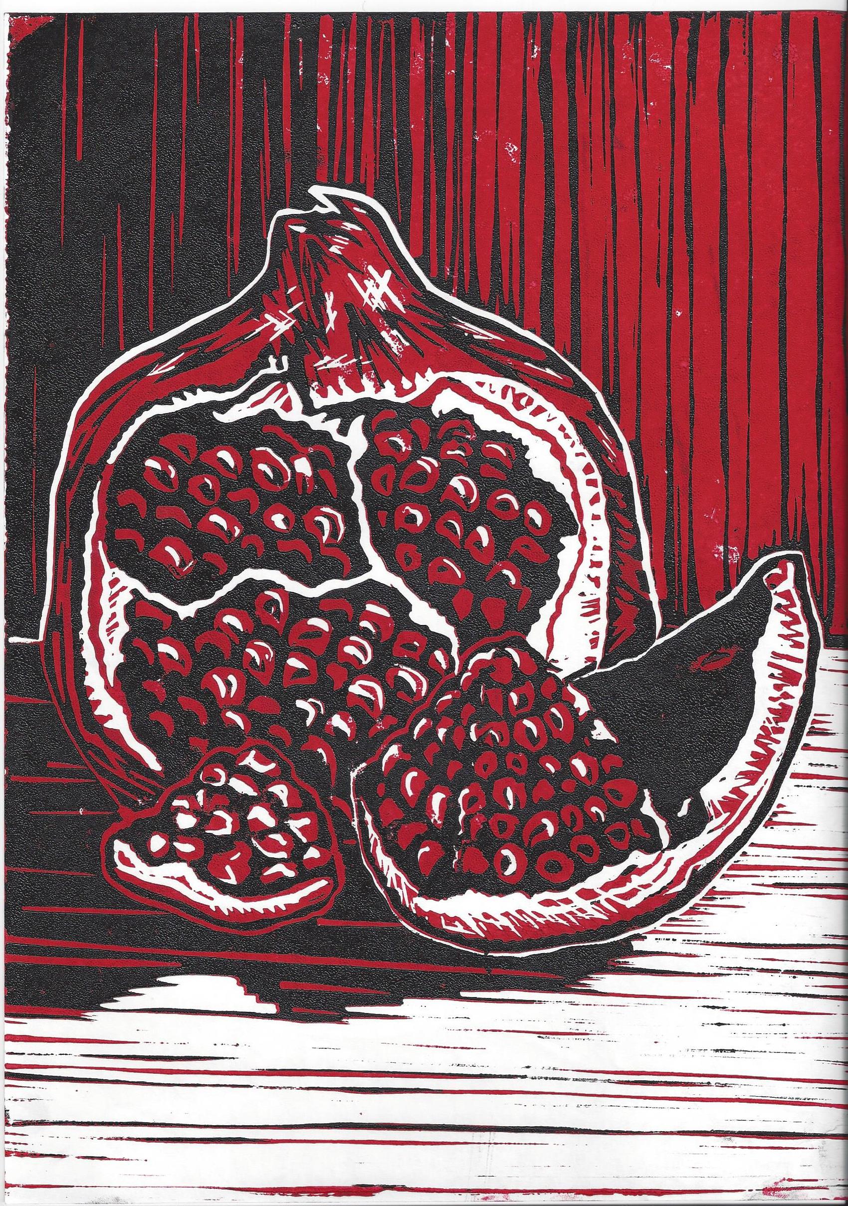
Note: I am not a huge fan of black and red as a combo. It can come off as aggressive. But I had wanted to do a pomegranate print for a long time and had originally thought a watercolor wash over black would be fine, but then I ate a pomegranate and the red color is so rich it seemed that a two-tone block would be the most rewarding.
It was a pain in the ass. Those little seeds were painstaking. Figuring out the background was a headache, but I felt rewarded seeing the finished product. I felt like I really started to understand how texture can come across in a lino cut here.
Want to get a clearer idea of what I’m talking about? Visit Pomegranate: Anatomy of a Print
