The Ford School of Public Policy, 12×18 (August 2014)
When I started my master’s program, I was told that I would be graduating in 2014, the centennial year for the Ford School of Public Policy at the University of Michigan. The summer in between my first and second year, I thought it could be fun to make a print commemorating the centennial and the completion of my degree. Perhaps I’m a glutton for punishment to spend my spare time crafting a piece of art based on a building I was in every day for two years. Unclear.
A few things to note:
- This was my first attempt at two-tone printing.
- I usually have limited patience for architecture given the need for precision.
- This is one of the largest blocks I’ve worked on.
Let’s dive in, shall we?
An Overview
Step 1: Source Material

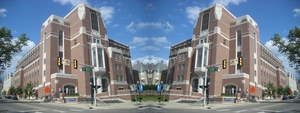
As with most things in life, this process begins with a Google search. It was fairly easy to find an “iconic” image of Weill Hall to use as a reference.
The way the printmaking process transfers ink from the block to the printing surface creates a mirror image. In order to get the final image to look like the picture taken by Michael Barera, I had to base my block off of the mirror of the original.
Again, using Google, I typed in “mirror image creator,” clicked on the first link, uploaded the image, and selected image reflection type “right.”
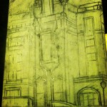
Step 2: First Sketch

This first sketch highlights the kind of loose lines that come naturally to me. In the right corner you can see some order starting to creep in, but mostly this stage is to establish the basic shapes and get the relationship between the different fields down. It is not uncommon for me to draw the central element so large that the rest of the object does not fit on the page. At this stage I have to remind myself to step away from the piece and stare at it longingly across the room to make sure that it works at a distance.
After the big areas are blocked off, I started going in with the ruler to get the lines in. You may notice that not all the of the details on the actual building are captured here. Why?

- Practicality: Even with a narrow cutting tool, it’s hard to get details under a certain size represented in the final print.
- Editing: It is not essential to have every detail in the photo represented in the final print to have the viewer recognize the object. Different mediums have different strengths. It’s my job as the artist to figure out what that transition is.
- Impatience: As I mentioned before, I struggle with precision. Sometimes I just move on.

All done! If you are using a discerning eye, you may notice that this is not a perfect, to-scale rendering. Here, I relied on my belief that printmaking is a bold, graphic medium that would absolve my cardinal sin of impatience. That and I didn’t want to do it over again.
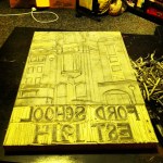
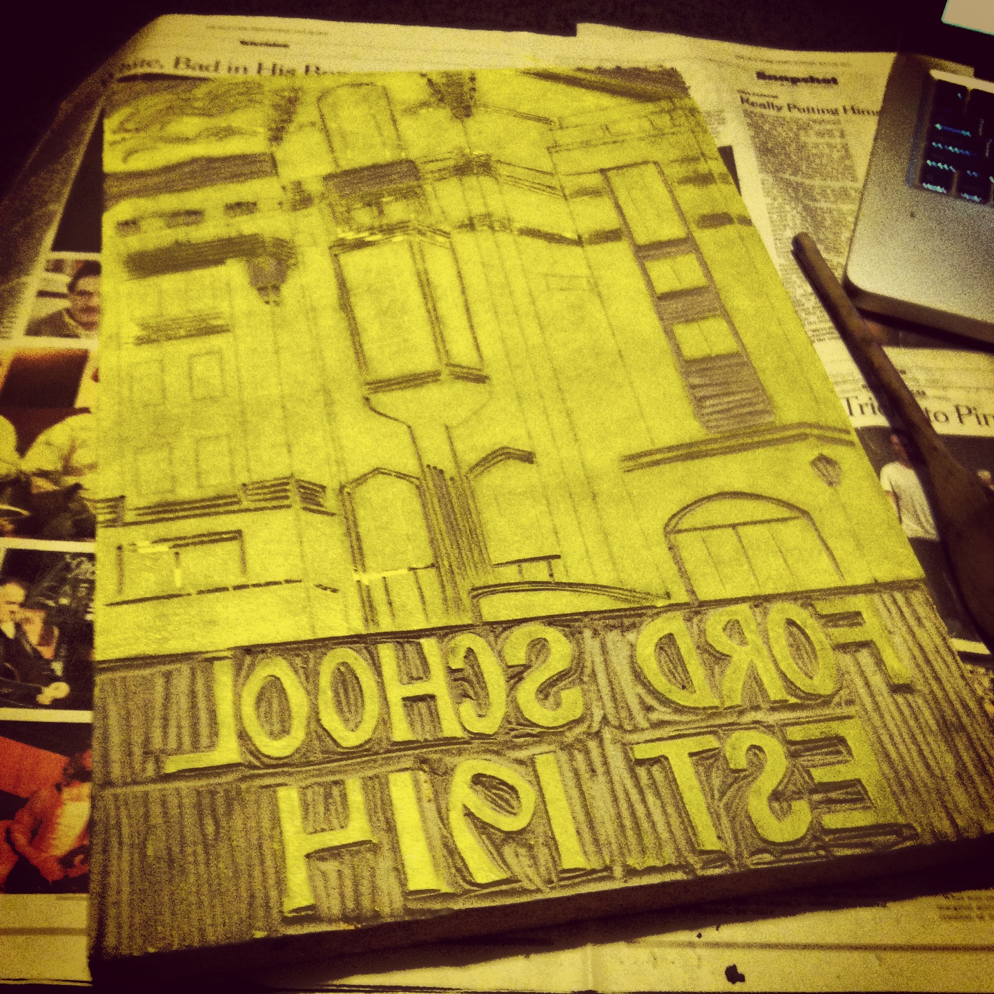
Step 3: First Cut*
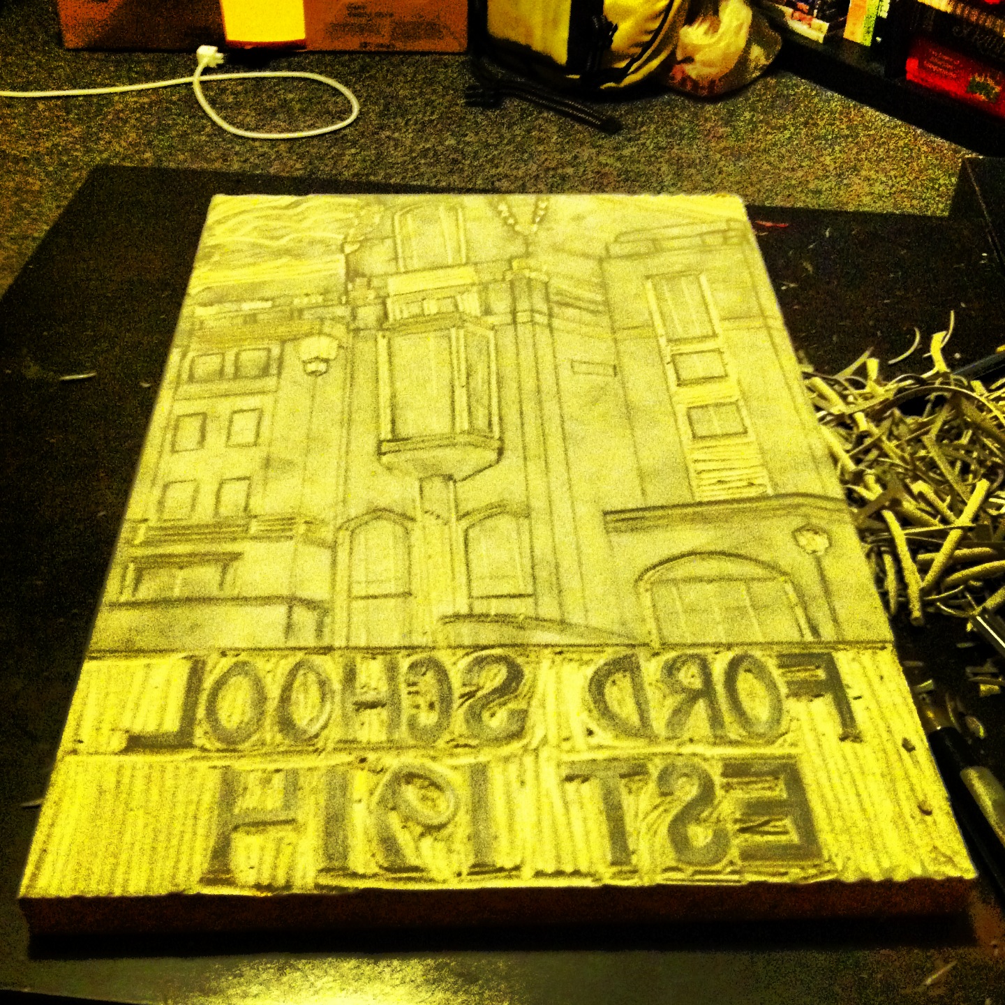
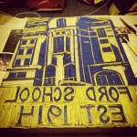
Now the fun begins. At this point, I took out my carving tools and began to cut. The thing to remember about this process is that it is subtractive. I am changing the surface by removal rather than say the earlier sketching, which added graphite to the surface. It’s a bit of a mental flip, right? The marks I am making to the block will end up being the white space on the print. You’ll see that the lettering is raised since I carved out all the space around it (see the pile of debris on the right), so the letters will be able to pick up the ink later on. With lino cuts, it is always best to err by leaving more block untouched. You can always shave off more. You can’t add pieces back to the block (although if someone out there knows how to do this, I would love to know).
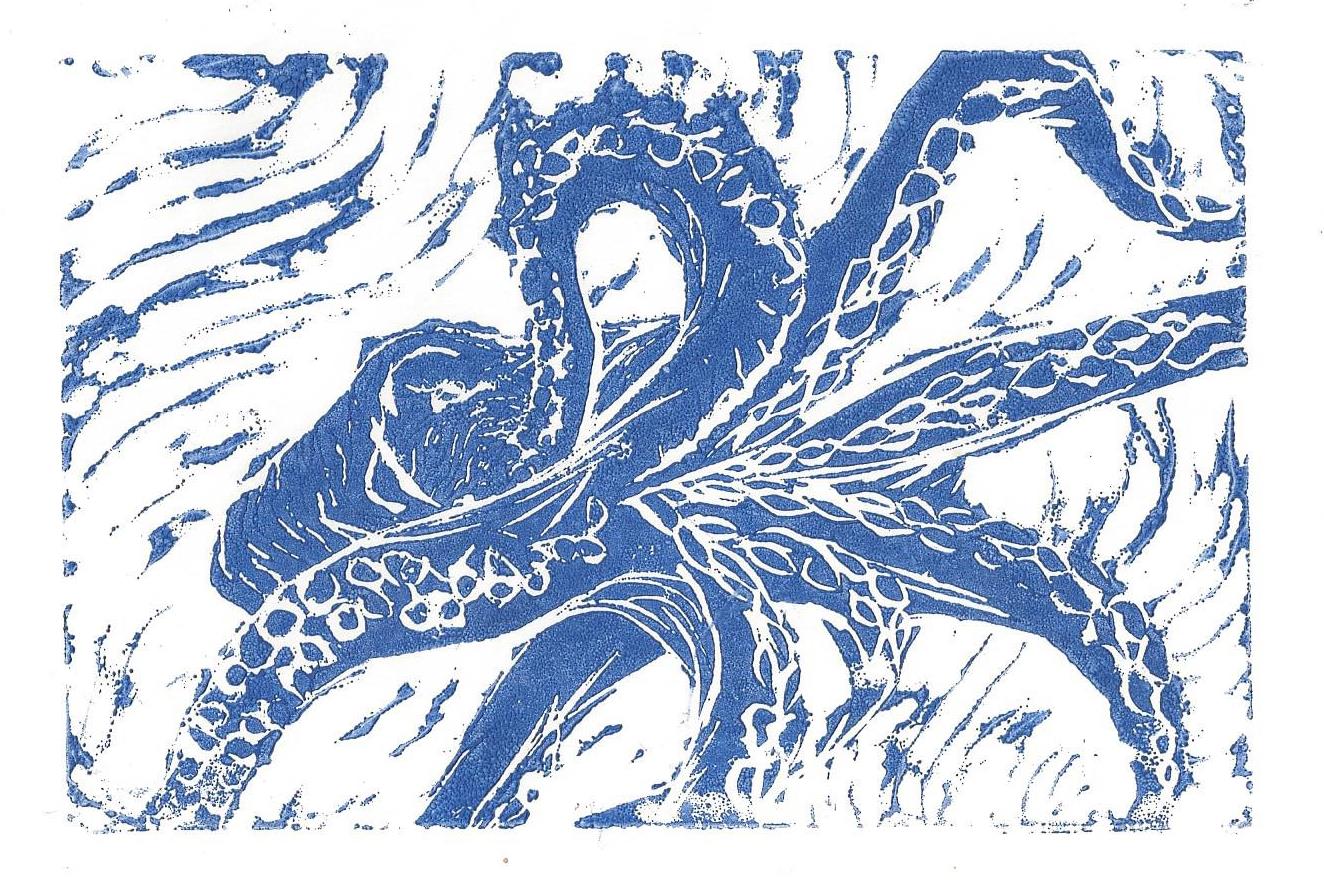
The direction of the cuts matters. The raised grooves will often catch some ink and will be transferred to the printing surface intermittently, often called “noise.”
The “noise” in the background of the small octopus is a great example. The use of curved lines to carve out the white space in the background gets picked up as a flowing, organic lines that lend the final print an aquatic feel.
One last thing about the first cut. It is the first cut. Conceptually, I am cutting out the white space and leaving the parts that will be picked up by both ink colors. The second cut will open the space for the yellow ink to come through and will leave the areas that will be blue.
Confused? So was I. I had to stop frequently to think of the piece in a series of layers. Let’s keep going.
Step 4: First Print
Now the printing process begins. I rolled yellow, oil-based printing ink onto a plastic plate, rolled the brayer around, then applied to the block until there was an even coat. You may realize that the first cut didn’t take much off the block, and you’d be right. If you look back the final print, it doesn’t have much white space.
Then, I took a sheet of paper, laid it down on the ink, and used the back of a wooden spoon to apply pressure evenly over the back of the print, working to make sure to press into the cut areas down by the letters to pick up ink and produce noise.
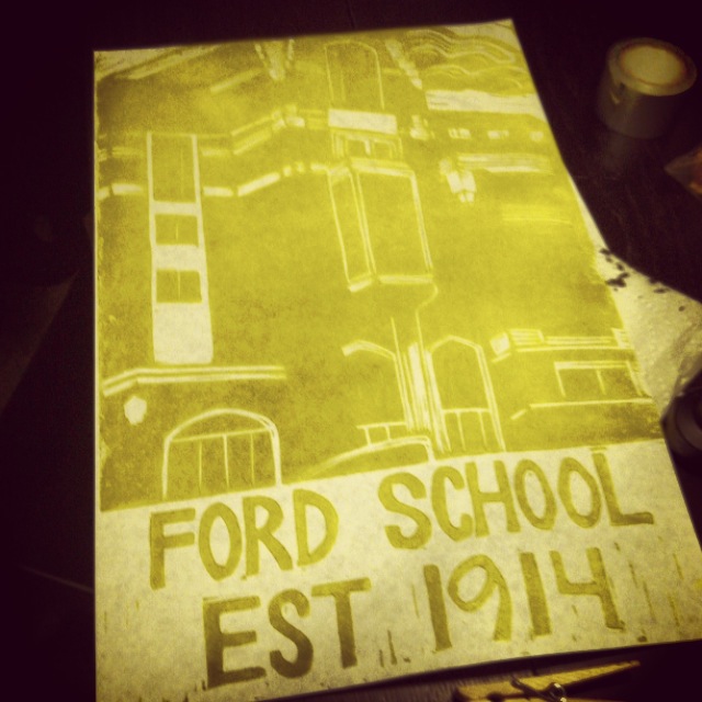
And there she is. The first inking complete!
At this point, I ran off a number of prints to see if corrections to the block were needed. Since this block would have two cuts, the final number of prints I would be able to produce would be determined by how many first inks I ran.
And up they go to dry for several days (oil-based inks take longer to dry). I wasn’t sure what yellow would look best, so I used the yellow ink without adjustment (the more lemon yellow on the left) and mixed in some brown to try and replicate the U of M maize. I made I think 10 of each.
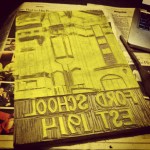
Steps 5-6: Second sketch, cut, and print
I’ve heard anecdotally that there are usually more pictures of first-born children. In this instance, it seems like I wasn’t as tethered to the documentation process since this is the only picture I can find of the second cut. In the second sketch, I had to imagine which areas of the final image I wanted to be yellow. Then I would carve those areas out, leaving the block as seen above. Here, you may notice that the shape of the building appears much more defined.
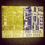
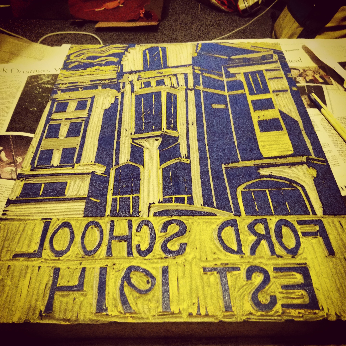
Here are the first and the second cuts side by side. The blue in the version above is straight from the tube. I also threw in a little black to make a navy ink.
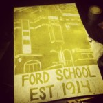
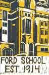
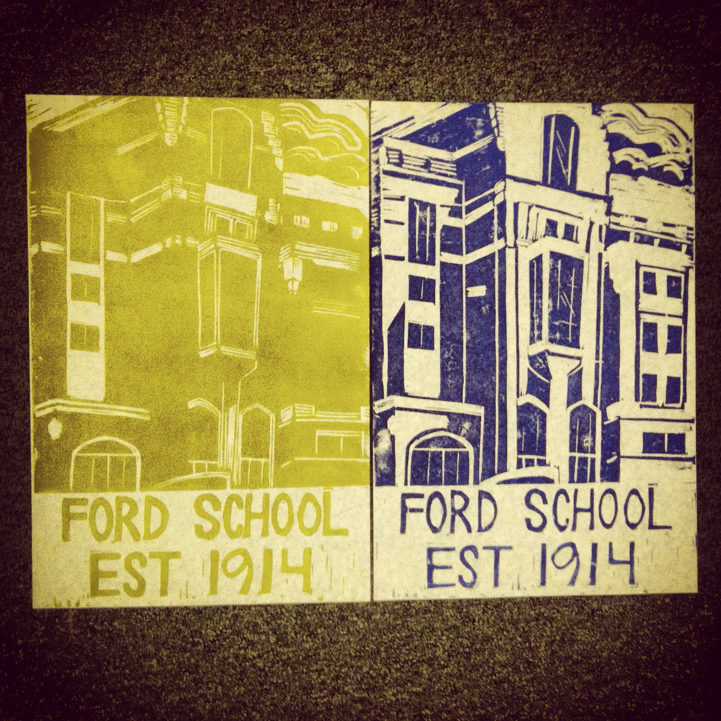
Step 7: Final print
And then for the moment of truth. Inking the second cut and rolling it onto one of the first prints. I tried all four color combinations (yellow x blue; yellow x navy; maize x blue; maize x navy), early on deciding that the maize x navy combination seemed to capture the U of M spirit the most.
Similar to my feelings with the Ford School, I went back and forth on how much of a success I thought this was, before ultimately deciding it was a success. I wouldn’t necessarily recommend embarking on two-tone prints with either a kind of subject matter they aren’t comfortable with or at this size; however, it can be done.
Fun fact: After I donated a framed piece to the annual Ford School Charity Auction, I was approached by other graduating Fordies who were interested in buying a print. This is also the first piece I ever sold and happened to contribute greatly to the post-grad school trip I took to Italy, which later inspired my piece on Venezia.
Questions? Want to tell me how awesome you think Michigan is? Send a Go Blue my way at writetolayne @ gmail dot com.
* It could be the deepest. Usually that’s a mistake. I can’t control the depth of my cuts or the volume of my voice. Equally awkward.

.jpg)